
 Echarts
...大约 7 分钟
Echarts
第01章 安装
> npm install echarts --save
第02章 引入
<script>
// 引入Echarts,注意引入位置
import * as echarts from 'echarts';

export default {
  props: {},
  components: {},
    data() {
    return {

    }
  },
  computed:{},
  created() {},
  mounted() {},
  methods: {

  },
}
</script>
第03章 折线图
样式一
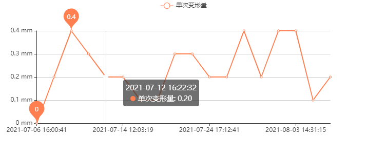
对于此样例传入的参数为:
timeXAxisArr = ['2021-07-06 16:00:41', '2021-07-07 11:23:05', '2021-07-08 16:20:49', '2021-07-10 09:45:36', '2021-07-12 16:22:32', '2021-07-14 12:03:19', '2021-07-16 11:37:39', '2021-07-18 11:21:45', '2021-07-20 11:36:40', '2021-07-22 11:32:18', '2021-07-24 17:12:41', '2021-07-26 16:15:45', '2021-07-28 16:36:40', '2021-07-30 15:08:19', '2021-08-01 14:36:00', '2021-08-03 14:31:15', '2021-08-05 14:35:10', '2021-08-07 14:47:02'];

singleYAxisArr = ['0.00', '0.20', '0.40', '0.30', '0.20', '0.20', '0.10', '0.10', '0.30', '0.30', '0.20', '0.20', '0.40', '0.20', '0.40', '0.40', '0.10', '0.20'];
<!--  用一个div表示图形区域 -->
<div class="chart single-deformation" ref="singleChart"></div>
// 引入Echarts,引入位置请查看本章中的《引入》
import * as echarts from 'echarts';
/**
 * 单次变形量折线图
 *
 * @param {Array<string>} timeXAxisArr X轴数据
 * @param {Array<number>} singleYAxisArr Y轴数据
 */
singleChart(timeXAxisArr, singleYAxisArr) {
  // 获取当前组件实例
  const self = this;
  // 获取用于绘制图表的 DOM 元素
  const chartDom = self.$refs.singleChart;
  // 初始化 ECharts 实例,并将其绑定到 DOM 元素上
  const myChart = echarts.init(chartDom);
  // 配置图表的选项
  const option = {
    title: {
      text: "", // 设置图表标题文本为空
    },
    tooltip: {
      trigger: "axis", // 设置工具提示触发方式为轴触发
    },
    legend: {
      data: ["单次变形量"], // 图例中显示的系列名称
    },
    xAxis: {
      type: "category", // 设置 X 轴类型为类目轴
      boundaryGap: false, // 不留白,线条从第一个点开始绘制
      data: timeXAxisArr, // X 轴数据,从传入的 timeXAxisArr 获取
    },
    yAxis: {
      type: "value", // 设置 Y 轴类型为数值轴
      axisLabel: {
        formatter: "{value} mm", // 设置 Y 轴标签格式,单位为 mm
      },
    },
    series: [
      {
        name: "单次变形量", // 系列名称
        type: "line", // 图表类型为折线图
        data: singleYAxisArr, // Y 轴数据,从传入的 singleYAxisArr 获取
        smooth: false, // 不设置平滑曲线
        markPoint: {
          data: [
            { type: "max", name: "Max" }, // 标记最大值
            { type: "min", name: "Min" }, // 标记最小值
          ],
        },
        itemStyle: {
          color: "rgba(255, 127, 80)", // 设置折线颜色
        },
      },
    ],
  };
  // 设置图表的选项
  option && myChart.setOption(option);
}
样式二

对于此样例传入的参数为:
title = 'u =  t/(7.0281 + 0.01871 * t)';
forecastArr = ['0.00', '0.11', '0.29', '0.53', '0.84', '1.09', '1.36', '1.63', '1.90', '2.16', '2.45', '2.70', '2.96', '3.21', '3.45', '3.70', '3.95', '4.19', '4.31', '4.43', '4.55', '4.67', '4.79', '4.90', '5.02', '5.14', '5.25', '5.37'];
measurementArr = ['0.00', '0.20', '0.60', '0.90', '1.10', '1.30', '1.40', '1.50', '1.80', '2.10', '2.30', '2.50', '2.90', '3.10', '3.50', '3.90', '4.00', '4.20'];
<!--  用一个div表示图形区域 -->
<div
  ref="regressionChart"
  v-if="expressionExist"
  style="height: 300px; width: 92%">
</div>
// 引入Echarts,引入位置请查看本章中的《引入》
import * as echarts from 'echarts';
/**
 * 根据函数表达式计算预测数据
 *
 * @param {string} title 函数表达式
 * @param {Array<number>} forecastArr 预测数据
 * @param {Array<number>} measurementArr 测量数据
 */
regressionAnalysisCurve(title, forecastArr, measurementArr) {
  const chartDom = self.$refs.regressionChart;
      const myChart = echarts.init(chartDom);
      const option = {
        title: {
          text: "回归函数:" + title,
        },
        tooltip: {
          trigger: "axis",
        },
        legend: {
          data: ["测量数据", "预测数据"],
        },
        xAxis: {
          type: "category",
          boundaryGap: false,
          data: timeXAxisArr,
        },
        yAxis: {
          type: "value",
          axisLabel: {
            formatter: "{value} mm",
          },
        },
        series: [
          {
            name: "预测数据",
            type: "line",
            data: forecastArr,
            smooth: false,
            itemStyle: {
              color: "rgba(255, 0, 0)",
            },
          },
          {
            name: "测量数据",
            type: "line",
            data: measurementArr,
            smooth: false,
            itemStyle: {
              color: "rgba(110, 110, 110)",
            },
          },
        ],
      };
      option && myChart.setOption(option);
}
第04章 柱状图
样式一
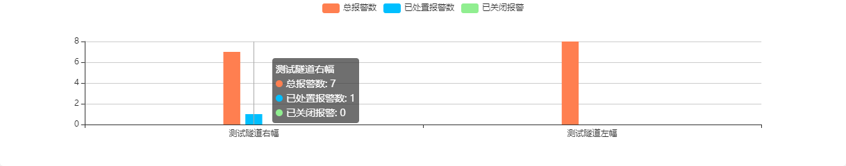
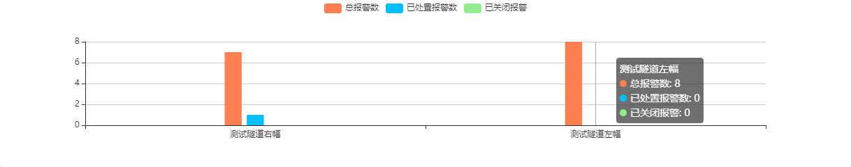
对于此样例传入的参数为:
name = ['测试隧道右幅','测试隧道左幅'];
total = [7, 8];
closed = [0, 0];
handled = [1, 0];
<!--  用一个div表示图形区域 -->
<div ref="alertManagementChart" style="width: 100%; height: 240px"></div>
// 引入Echarts,引入位置请查看本章中的《引入》
import * as echarts from 'echarts';
/**
 * 报警管理统计柱状图
 *
 * @param {Array<string>} name - X 轴数组,表示每个类别的名称
 * @param {Array<number>} total - Y 轴数据,表示总报警数的数组
 * @param {Array<number>} closed - Y 轴数据,表示已关闭报警的数组
 * @param {Array<number>} handled - Y 轴数据,表示已处置报警数的数组
 */
alertManagementCurve(name, total, closed, handled) {
  // 初始化 ECharts 实例,绑定到指定的 DOM 元素上,和 div 中的 ref 对应
  this.chart = echarts.init(this.$refs.alertManagementChart);

  // 配置图表的选项
  const option = {
    // 设置图表的标题
    title: {
      text: '' // 标题文本为空
    },
    // 配置工具提示,显示在鼠标悬停时
    tooltip: {
      trigger: 'axis' // 鼠标悬停时触发的方式为轴触发
    },
    // 设置图例,表示不同系列的名称
    legend: {
      data: ['总报警数', '已处置报警数', '已关闭报警'] // 图例中显示的系列名称
    },
    // 配置 X 轴
    xAxis: {
      type: 'category', // X 轴类型为类目轴
      data: name, // X 轴数据,从传入的 name 数组获取
      axisLabel: {
        interval: 0 // 标签间隔设置为 0,表示不跳过标签
      }
    },
    // 配置 Y 轴
    yAxis: {
      type: 'value' // Y 轴类型为数值轴
    },
    // 配置数据系列
    series: [
      {
        name: '总报警数', // 系列名称
        type: 'bar', // 图表类型为柱状图
        data: total, // Y 轴数据,从传入的 total 数组获取
        barWidth: '5%', // 设置柱子的宽度为 5%
        itemStyle: {
          color: 'rgba(255, 127, 80)', // 设置柱子的颜色
          emphasis: {
            color: 'rgba(255, 127, 80)' // 鼠标悬停时柱子的颜色
          }
        },
        barCategoryGap: '50%' // 设置同类目柱子之间的间距
      },
      {
        name: '已处置报警数', // 系列名称
        type: 'bar', // 图表类型为柱状图
        data: handled, // Y 轴数据,从传入的 handled 数组获取
        barWidth: '5%', // 设置柱子的宽度为 5%
        itemStyle: {
          color: 'rgba(0, 191, 255)', // 设置柱子的颜色
          emphasis: {
            color: 'rgba(0, 191, 255)' // 鼠标悬停时柱子的颜色
          }
        },
        barCategoryGap: '50%' // 设置同类目柱子之间的间距
      },
      {
        name: '已关闭报警', // 系列名称
        type: 'bar', // 图表类型为柱状图
        data: closed, // Y 轴数据,从传入的 closed 数组获取
        barWidth: '5%', // 设置柱子的宽度为 5%
        itemStyle: {
          color: 'rgba(144, 238, 144)', // 设置柱子的颜色
          emphasis: {
            color: 'rgba(144, 238, 144)' // 鼠标悬停时柱子的颜色
          }
        },
        barCategoryGap: '50%' // 设置同类目柱子之间的间距
      }
    ]
  };

  // 设置图表的选项
  this.chart.setOption(option);
}
第05章 饼状图
样式一
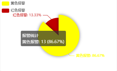
对于此样例传入的参数为:
yellowAlert = 13;
redAlert = 2;
<!--  用一个div表示图形区域 -->
<div ref="currentAlertChart" style="width: 100%; height: 240px"></div>
// 引入Echarts,引入位置请查看本章中的《引入》
import * as echarts from 'echarts';
/**
 * 当前报警统计饼状图
 *
 * @param {number} yellowAlert - 黄色报警的数据量
 * @param {number} redAlert - 红色报警的数据量
 */
currentAlertCurve(yellowAlert, redAlert) {
  // 初始化 ECharts 实例,绑定到指定的 DOM 元素上,和 div 中的 ref 对应
  this.chart = echarts.init(this.$refs.currentAlertChart);
  // 配置图表的选项
  const option = {
    title: {
      text: '', // 设置饼状图的标题文本为空
      left: 'center' // 设置标题的位置为居中
    },
    tooltip: {
      trigger: 'item', // 鼠标悬停时触发的方式为项目触发
      formatter: '{a} <br/>{b}: {c} ({d}%)' // 设置工具提示的格式
    },
    legend: {
      orient: 'vertical', // 设置图例的排列方向为垂直
      left: 'left', // 设置图例的位置为左侧
    },
    series: [
      {
        name: '报警统计', // 系列名称
        type: 'pie', // 图表类型为饼状图
        radius: '50%', // 饼状图的半径为 50%
        center: ['50%', '50%'], // 设置饼状图的中心位置为居中
        data: [
          { value: yellowAlert, name: '黄色报警' }, // 黄色报警的数据
          { value: redAlert, name: '红色报警' } // 红色报警的数据
        ],
        label: {
          show: true, // 显示标签
          position: 'outside', // 标签位置在外部
          formatter: '{b}: {d}%' // 标签格式,显示名称和百分比
        },
        itemStyle: {
          color: function(params) {
            const colorList = ['#ffff00', '#c00000']; // 定义颜色列表
            return colorList[params.dataIndex]; // 根据数据索引返回相应的颜色
          }
        },
        emphasis: {
          itemStyle: {
            shadowBlur: 10, // 鼠标悬停时的阴影模糊度
            shadowOffsetX: 0, // 鼠标悬停时的阴影X偏移量
            shadowColor: 'rgba(0, 0, 0, 0.5)' // 鼠标悬停时的阴影颜色
          }
        }
      }
    ]
  };
  // 使用配置项填充图表
  this.chart.setOption(option);
},
Powered by Waline v2.15.8